Monday, May 12, 2008

im a little teapot...

would you like a cup of tea?
tea was a very expensive product when it was first introduced to Europe from China. the teapot is even more rare. Marco Polo brought back few Chinese teapots for the king which soon was copied by the Europeans. the first Europeans teapots only held one or two cups of tea because it was a pricey beverage. the teapot have changed shapes and size since whether it is made of silver, porcelain or pottery. of course the size increased, while the pot became round from 1730-1760, pear-shaped during 1730s, inverted pear-shaped from around 1750s to 1775, straight sides from 1790 to 1810, round and fat body with a base from 1810 to 1835 and now all imaginable shapes are possible.


another clue to when porcelain or pottery teapots were manufactured are the holes inside the teapots at the base of the spout. in the 18th century, the holes were often uneven and few (about 3) compared to those later on. another characteristic about 18th century teapots is that the lid have deep rims that extend down to the body of the teapot. however, the teapots made in Europe had glazed rims because the makers were not skilled enough to make and glaze the whole teapot together like the Chinese did.


silver teapots on the other hand, did not have all metal handles until after the 1850s. wood or ivory was used for the handles instead so that one can hold it even if the silver pot was too hot to hold. Henry Reed was the revolutionist of teapot handles when he insulate the handles with oyster shells in 1849. from then on, the silver teapot handles were insulated with wood or ivory insets.


- cup of red

Friday, May 9, 2008

bubbly delights - wonders of champagne


*POP* and celebrate! what's a celebration without champagne? the bubbly delight that we have grown to love? but do we really know what champagne is?

champagne is actually is appellation (a region where grapes used for the wine are grown) in France. we commonly mistaken the use of the word "champagne" to mean all sparkling. however, only grapes in that region used to make it are technically able to use the word on its label.

champagne, the drink, was a mistake. Champagne, the region, is colder than most terroirs, so wine harvested in the fall will not be properly fermented in the winter because the temperature is too cold for the yeast to carry out the process. when the temperature becomes warmer in the spring, the yeast become active again and a second fermentation is conducted resulting in the bubbly delight!

a monk, Dom Perignon, wanted to get rid of the bubbles from the wine, but never succeeded. so the wine makers of Champagne soon learned to embrace the sparkling goodness and perfect it to what we know as champagne.

how is it made? by using champagne's methode champenoise of course :)

3 types of grapes are used, the chardonnay, pinot noir and pinot meunier. the grapes are blended and sugar and yeast mixture are added according to the amounts desired by the winemaker. the bottles are corked so that when the yeast ferments, the carbon dioxide has nowhere to go except back into the liquid creating the bubbles! after a year, the bottles are turned on an angle and all the yeast eventually settles into the neck of the bottle. the neck is then frozen, the cork removed and the frozen tube of yeast popped off. a bit of wine and sugar is added after, the bottle is then corked and eventually will end in our enjoyment.


*tips: to maximize your enjoyment of champagne, chill before serving and slowly remove the cork when opening to minimize the escape of the bubbles (less noise = better).
enjoy a glass of champagne with a flute, which is specially designed to also preserve the bubbles.

- cup of red

Thursday, May 8, 2008

zip it up - system 2k07 by miguel rios design


system 2k07 is a series of 7 parts that you can assemble with a zip to all different kinds of bags or container - BOX, LAPTOP, POCKET, PORTFOLIO and STREET. it can be transformed into rain protection when combined with the Drizzle System also designed by miguel rios design team based in Portugal. check out the pictures below, its the perfect marriage between fashion and product design!

(doesn't it look like a scene from The Island?)

- cup of red

Tuesday, May 6, 2008

red, blue and yellow - the past and present of "de stijl"

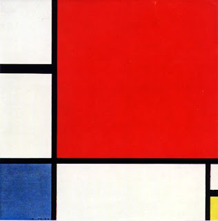
recognize this painting?


i'm sure i do, because i painted it on one of my bedroom walls...it's Piet Mondrian's "composition with red, blue and yellow"!

you'd think it that it's some guy who decided to paint a few lines and squares and decided to call it art. but no, Piet Mondrian's piece is part of a revolutionary movement in art called "de stijl" or "the style" in Dutch. it was a Dutch group of artists in the 1917-1931, which consisted of neoplastic artists like Piet Mondrian and Theo van Doesburg (founder of de stijl).

the principles of de stijl are very simple...use only
1) straight horizontal or vertical lines
2) rectangle elements
3) primary colours of red, blue and yellow
4) primary values of black, white and gray

and...no
5) intersection of lines
6) symmetry

de stijl painters had ideals influenced by cubist art, in which they attempted to paint perfect lines and forms. de stijl is not limited to paintings, but extended its influences to music and architecture.

in music, Jakob van Domselaer was the composer who applied the de stijl principles of painting into his compositions. His compositions, such as Proeven van Stijlkunst ('Experiments in Artistic Style'), demonstrated minimalist and pure sounds of only "horizontal" and "vertical" elements. you'll get what i mean if you listen to this: http://www.dofoundation.com/dr001_GB.html.

architecture wise, there is the "Rietveld Schröder House" built by Dutch architect, Gerrit Rietveld, which was designed to have no walls!


in the picture, you see the "red and blue chair" also by Gerrit Rietveld that has no intersecting elements...

i saw a modern twist of the chair the other day (again at Gastown), but this time it is made of lego! it is called "106% red-blue rietveld chair" by Mario Minale, whose works call for a whole other blog entry for themselves. it is 6% larger than the original chair due to the nature of lego.


where you can visit the "Rietveld Schröder House": Prins Hendriklaan 50, Utrecht, The Netherlands

where you can get the "106% red-blue rietveld chair": INFORM Interiors @ Gastown

*interesting fact: "I paint modern" is an anagram of "Piet Mondrian" :)

- cup of red

Monday, May 5, 2008

equestrian inspirations - ralph lauren s/s 08


Ralph Lauren isn't just all about polo shirts. it's 40th anniversary spring/summer 08 collection consists of elegant cotour inspired by My Fair Lady. from boyish suits to feminine dresses with oversized hats (by Phillip Treacy and Patricia Underwood), this is truely an awe-ing collection. here are some of my favourites below:

black and white cocktail dress...i love how the hat looks like a trail of ink flowing from it...like a watercolour art piece...


boyish equestrian suit...


statement trench...notice the ankle boots and the yellow...totally an s/s 08 trend


delicate sequins...


pure whites...


feminine florals...another s/s 08 trend, but not hard and overboard like Balenciaga


where you can get Ralph Lauren: Holt Renfrew @ Pacific Centre


*interesting facts: Ralph Lauren was born Ralph Lifshitz and his brother changed their lastname to Lauren at age 16...i wouldn't blame them


Ralph Lauren first dib in the fashion business was when he sold ties to fellow classmates in grade school

- cup of red

Sunday, May 4, 2008

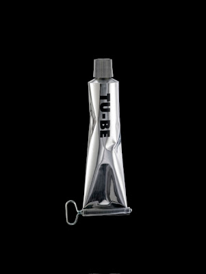
toothpaste TU-BE chandelier

i passed by Gastown the other day and saw this eye-catching TU-BE chandelier by Ingo Maurer and Ron Arad...made of recycled metallic toothpaste tubes!


where you can get TU-BE: INFORM Interiors @ Gastown


- cup of red